
Viser innlegg med etiketten Kirkeberg. Vis alle innlegg
Viser innlegg med etiketten Kirkeberg. Vis alle innlegg
søndag 26. mai 2013
Eomer
At the moment I'm working on some Tolkien fan art, so until I have that done, I'd like to share with you an old sketch I had lying about. I think it's supposed to be Eomer.


torsdag 9. mai 2013

søndag 5. mai 2013
Big Rock Candy Mountain
Here's an illustration based on the song "Big Rock Candy Mountain" by
Harry McClintock. The piece illustrates the part with the lake of stew.


torsdag 2. mai 2013
Snake Chase
Here's a quite vertical piece I did. It's based of a concept I came up with and would be part of a series of artworks/prints that takes place in the same universe. There is no name to this story and neither do the characters. Because I might delve deeper into this story, I'm keeping the cards close to my chest.
Needles to say, inspirations have been Indiana Jones, Star Wars, Firefly, Ducktales, Carl Barks/Don Rosa, Tintin, Drew Struzan etc.


Needles to say, inspirations have been Indiana Jones, Star Wars, Firefly, Ducktales, Carl Barks/Don Rosa, Tintin, Drew Struzan etc.


søndag 28. april 2013
Frog on the Table
Here is the very last spot illustration. It's a little scene of three unlikely animals eating at a restaurant that got a little merry after too much food and wine.


torsdag 25. april 2013
Secret Agent Men
Here's my second spot illustration. And it's about two secret agents who are spying on eachother in a perhaps not so discrete manner.


søndag 21. april 2013
A Sensational Invention: The Key Finder!


torsdag 18. april 2013
Two For the Price of None
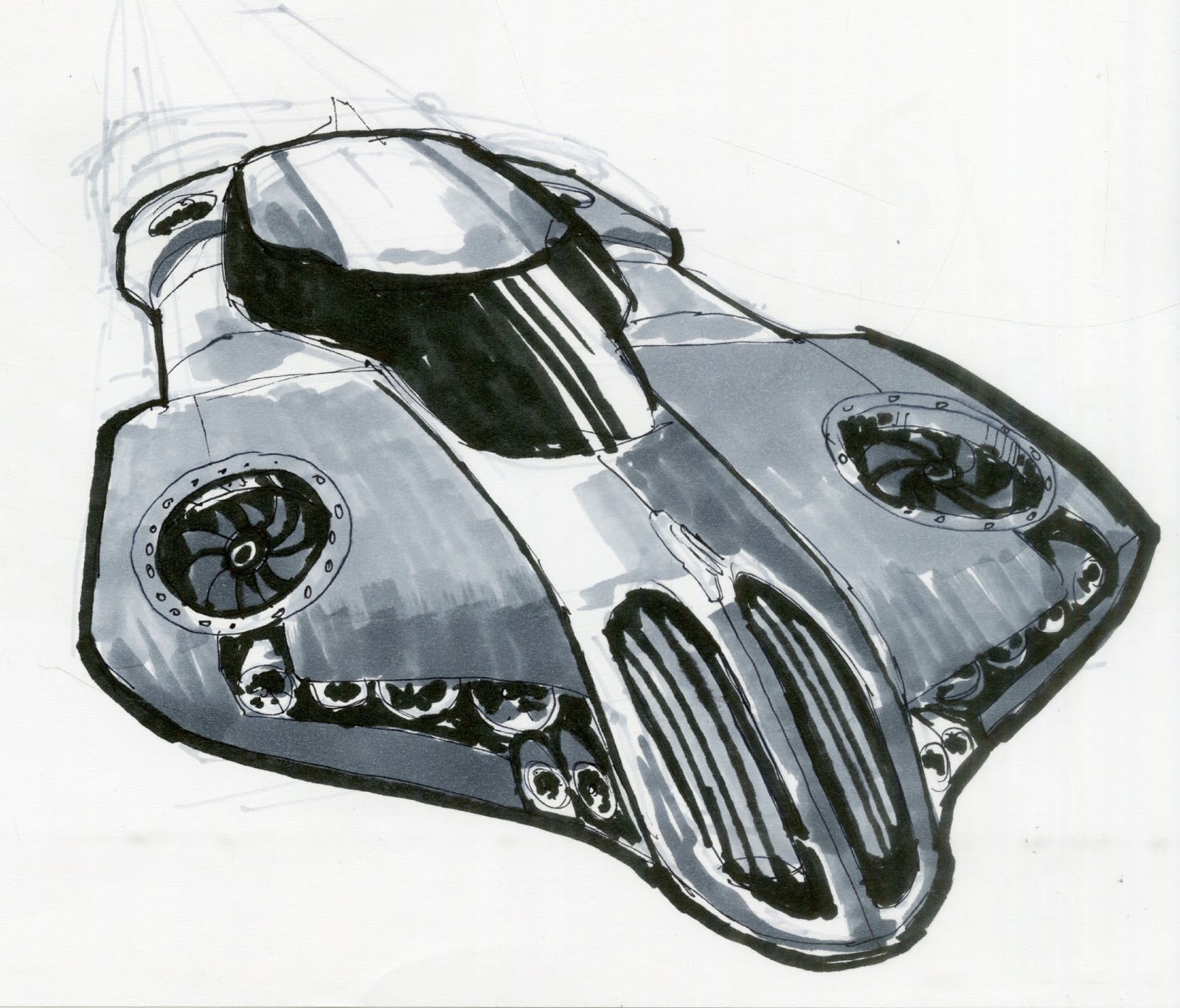
Ahoy-hoy! Here we are with yet another blog post and we're continuing the trend of last post by uploading some sketches. This time TWO for the price of none. Enjoy. I'm still trying to catch up after S.P.A.C.E. but I will post a three part series next sunday. Just some humorous spots. Will they make you laugh, giggle, shead a tear, smile, nod in approval, indifferent, or flip the table in anger? Time will tell.



søndag 14. april 2013
Almost No Milk Today
This week have been hectic, hence the lacking update on Thursday. And today will not fare too much better. I've just come back from the local comic book convention called S.P.A.C.E. (not to be confused with the final frontier). I sold a few prints, yay. However, I haven't been able to have some art ready for this post, other than a sketch. It's something, I guess. It's a cockpit.


søndag 7. april 2013
Mecha-snake-dragon
It's been a long time since I posted sketches so here we go. This is a dragon design we're using in a short comic. It's a mecha-snake-dragon!


torsdag 4. april 2013
Il Buono Il Cattivo Il Brutto
So here we are with yet another western movie poster starring Clint Eastwood. This time it is the one and only "The Good, The Bad and The Ugly". This piece underwent much frustration and many changes. At the very least it turned out better than my last poster, so I guess I should be pleased.
 This was actually a revision of the final turned in piece. Here is the original, that had much more red in it like some of the posters of the Dollars-trilogy had.
 But my teacher sad the colours sucked, so that's why I redid the colours. However, that was the last step of many frustrations regarding the piece. Here are many of the steps that this piece underwent. First up is the thumbnail/concept stage.

 However, the lack of enthusiasm for the sketches, prompted me to try to come up with something better.


However, aside from the nice touches with the flags and good likenesses, the critique was "pretty fuckin' boring", so back to the drawing board. Less than a week before the deadline. Add in two tests (in in biotechnology, yikes) and I was in for a stressful week. Not to mention the other homework I had to do. However, I got crackin', redrew a more pimped up version of the sketch.

 So all in all, considering the time I had on the actual piece and the amount of frustration in my life at the time, it did turn out okay.


However, aside from the nice touches with the flags and good likenesses, the critique was "pretty fuckin' boring", so back to the drawing board. Less than a week before the deadline. Add in two tests (in in biotechnology, yikes) and I was in for a stressful week. Not to mention the other homework I had to do. However, I got crackin', redrew a more pimped up version of the sketch.


søndag 31. mars 2013

torsdag 28. mars 2013
Titanic II on ice
This is a satire piece that we had to do. I'm poking a little fun of the inevitable fait of the Titanic II when it set sails in a couple of years.
I hope you get the joke. I also added another concept here, that didn't make it through to become a final:


I hope you get the joke. I also added another concept here, that didn't make it through to become a final:


søndag 24. mars 2013
A Fistful of Dollars
Here's a movie poster I did. It wasn't originally a movie poster, but turned out that way. This piece went through a lot of stages and ended up okay. I wish it was better, but hey, could be worse.

First off, it wasn't a western piece at all. I had ideas for many things, but eventually ended up with the western thing as it was the one that had the most response/least dislikes. But anyways, here are the first concepts:


However, the teacher was not very pleased with the pose of my gunslinger, so I changed it up to this:
 I liked it so, it was off to make the line drawing, however getting proper reference for this pose would prove to be a challenge.


 So, the result was that the pencil drawing lost whatever the sketch had, and I was back to square one. Something had to be done. It was time to do a vignette, like my teacher wanted us to do in the first place.

 The result ended up being okay. I put Eastwood's face in there and made it an actual movie poster, as opposed to a made up film I initially planned to do, as people thought it was Eastwood in the first place. I actually liked the line drawing more than the finished piece (with the flat and graphic colours), which has prompted me to rethink how I approach the final art. Some of that could be seen in my previous post. That piece was made after this. Lines might play a bigger role in the future I think.

First off, it wasn't a western piece at all. I had ideas for many things, but eventually ended up with the western thing as it was the one that had the most response/least dislikes. But anyways, here are the first concepts:


However, the teacher was not very pleased with the pose of my gunslinger, so I changed it up to this:


torsdag 21. mars 2013
Flåklypa Grand Prix
This piece was made for a
competition held by the student collective. The competition is called
"Childhood Inspiration" and the entries must be about something that was
inspirational to you as a child. The movie "Flåklypa Grand Prix" was my
favourite movie as a child so I figured it was only proper to do a
piece about it. Also, I knew I would be the only one to do it, so I
would bring something unique to the table.
The movie, called "Pinchcliffe Grand Prix" is a stop and go animation from 1975 about bicycle repairer Theodore Rimspoke and his compatriots who build a homemade race car to challenge Rimspoke's former assistant who has become a successful racing driver by using a technical innovation build after blue prints stolen from Rimspoke.
The movie was made by Ivo Caprino and his studio and was based on the fictional universe "Flåklypa" made by Kjell Aukrust.
The car, Il Tempo Gigante, has legendary status in norwegian movie history. Undoubtedly the coolest movie car ever made in my and many, many other norwegians opinions. It actually Inspired a young swede to make his own car. His name? Koeniggsegg. For those unaware of the name, look it up. Let's say the swedes does know to build cars that are not just metrosexual estates.
Oh, and they actually build Il Tempo Gigante in real life. With a 1000+ bhp turbine jet engine in the back. They don't use it anymore as it is too powerful (just the one engine, it has a 500bhp v8 in the front of course) and it doesn't comply with Eu regulations for noise. No joke.
This piece in particular was made with the total of three programmes, PS, Painter and Sketchbook Pro.
The movie, called "Pinchcliffe Grand Prix" is a stop and go animation from 1975 about bicycle repairer Theodore Rimspoke and his compatriots who build a homemade race car to challenge Rimspoke's former assistant who has become a successful racing driver by using a technical innovation build after blue prints stolen from Rimspoke.
The movie was made by Ivo Caprino and his studio and was based on the fictional universe "Flåklypa" made by Kjell Aukrust.
The car, Il Tempo Gigante, has legendary status in norwegian movie history. Undoubtedly the coolest movie car ever made in my and many, many other norwegians opinions. It actually Inspired a young swede to make his own car. His name? Koeniggsegg. For those unaware of the name, look it up. Let's say the swedes does know to build cars that are not just metrosexual estates.
Oh, and they actually build Il Tempo Gigante in real life. With a 1000+ bhp turbine jet engine in the back. They don't use it anymore as it is too powerful (just the one engine, it has a 500bhp v8 in the front of course) and it doesn't comply with Eu regulations for noise. No joke.
This piece in particular was made with the total of three programmes, PS, Painter and Sketchbook Pro.


Abonner på:
Innlegg (Atom)